
Blue wallpaper has the unique ability to completely transform any room into a serene, luxe space – with shades ranging from deep, dramatic navies to bright and airy pastels. The beauty of this color palette is the versatility it provides when color-matching the rest of your space through furniture, accessories, or murals. Getting your wallpaper shade right is only one aspect of achieving the most beautiful space imaginable. We’ve gathered some expert interior design tips to help you match your furniture and accessories with blue wallpaper and bring your space to life.
Color-matching teal wallpaper

Teal wallpaper can open a world of possibilities in your home. This mystical blue-green shade is one of the more unique shades of blue, not quite falling into any specific color category. If this speaks to your personality – that is – not allowing yourself to be boxed in by labels – it could be a great way to express yourself through design.
This cool, radiant color has been popular since Egyptian times and is still a modern-day favorite. There are numerous ways to compliment a teal room.
White is a favorite for bringing a teal-colored room together in a clean, contemporary way. If white is a bit on the bright side for your liking, other neutrals such as cream or tan also work excellently with teal. You can introduce these neutrals through scatter cushions, curtains, or even abstract wall art.
For a more understated, urban look – opt for slate or grey to pair with teal. Slate accessories create a classic look when highlighted against a teal backdrop, and any shade of grey will work with this blue-green hue.
For a bold, brave look try gold or silver! Metallics have an uncanny ability to bring teal to life and make an excellent color selection to accessorize your room with. You might even want to explore your creativity with gold leaf applied to your teal wallpaper, or perhaps introduce metallic colors and textures through a wire lampshade or gold vase.
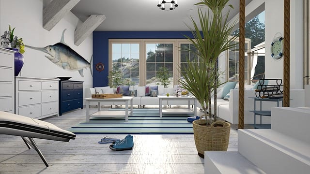
Color-matching navy wallpaper

Navy is the darkest shade of blue and has a certain allure to it. This dramatic color is exceptionally eye-catching and can bring a striking ambiance to any room. Often seen in coastal and nautical styles, navy can be beautifully enhanced with an array of colors.
For a daring look, color match navy with pops of orange, lime green, or coral. You’ll notice these colors all appear in nature – along with the blue shades we love. These colors are bright and cheery, which helps to lighten the moody navy shade, while still adding a spark of personality to the space.
For an elegant look, keep the color palette simple. If you add a pop of color with metallics, try to keep any additional colors neutral. A gorgeous gold sculpture against a navy backdrop looks chic and will look even better with white or tan accessories around it instead of overdoing it with excessive amounts of gold accessories.
Top tips for color-matching blue wallpaper
Avoid too-similar shades.
Navy blue, for example, can become easily ‘washed out’ when paired with royal blue or azure blue – simply because they’re so similar in tone. Stick to one shade in your wallpaper and use complementary colors to give it a boost and accentuate it.
Don’t overdo the blue.
While blue is a versatile color, try keeping it to one room. For example – a blue open plan kitchen and lounge setup can easily become one overly large space when stretching the same shade of blue throughout. Try to break up your space visually by using varied shades.
Add splashes of white
Skirtings and ceilings dressed in a fresh lick of brilliant white will really make the blue stand out. A yellowed or faded ceiling can detract from the intensity of your blue tone and make the room seem incomplete. Ensure you paint the ceilings and skirting boards before you apply the wallpaper to avoid any paint splashes or wobbly lines.
Keep it simple.
Choose one or two highlight or accent colors and stick to them. Using a bright color, a neutral and a metallic will overwhelm the room and make it appear very busy – quite the opposite of the calming effect blue is known to have.
Choose monochrome for simplicity.
Committing to a specific accent color might be a bit overwhelming – and the easiest way around this is to opt for black and white accessories. The beauty of this is that you can always add on new colors as you discover them, without the commitment of having a coral sofa in your living room. You can always add pops of color to black and white to enhance your blue wallpaper room!
How have you incorporated blue into your favorite space? One thing is for sure; this color palette provides some of the most creative ways to make your home a haven of tranquillity. If you’ve been bitten by the redecorating bug, why not browse our range of blue wallpaper?